Color, color, color!
It is hard to explain to people who are not “color-blind” the thrill of being in a saturated-color environment. My (Ben) normal life plays out not entirely, but mostly, in “sepia”. It takes a lot of sh’bang, colorwise, to get me to register colors outside of my sepia perception range, and that’s why Peta tends to wear, whenever our environment permits it, bright and colorful clothes.
India is therefore a unique experience for me (and for us all). The brightly colored saris everywhere have me do double and triple takes, and generally jump for joy at the technicolor reality all around. The culture of bright and colorful saris is of course, not accidental. Correct or not, from a historical perspective, we have concluded that the bright saturated sari colors probably find their grounding in all the rich colors found at most Hindu temples.
So, for my last enjoyment before I return to my mostly sepia reality, we conclude our visit to India’s Tamil Nadu region with a stroll through a richly decorated and colorful temple, in Pondicherry, Tamil Nadu.
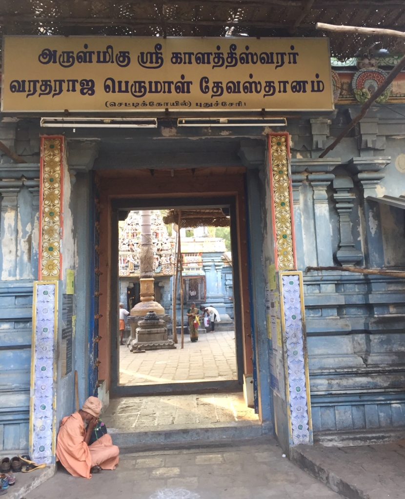
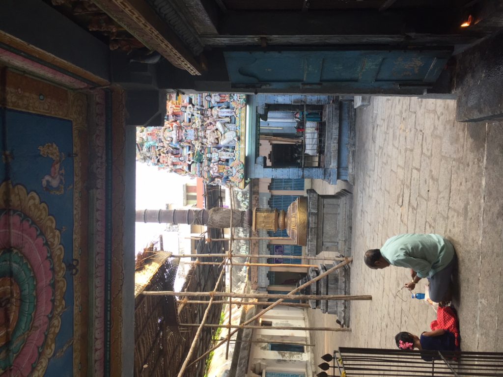
A sadhu in peach colored robes sits against the pastel blue entrance to the temple. The sunlit courtyard beckons us in.
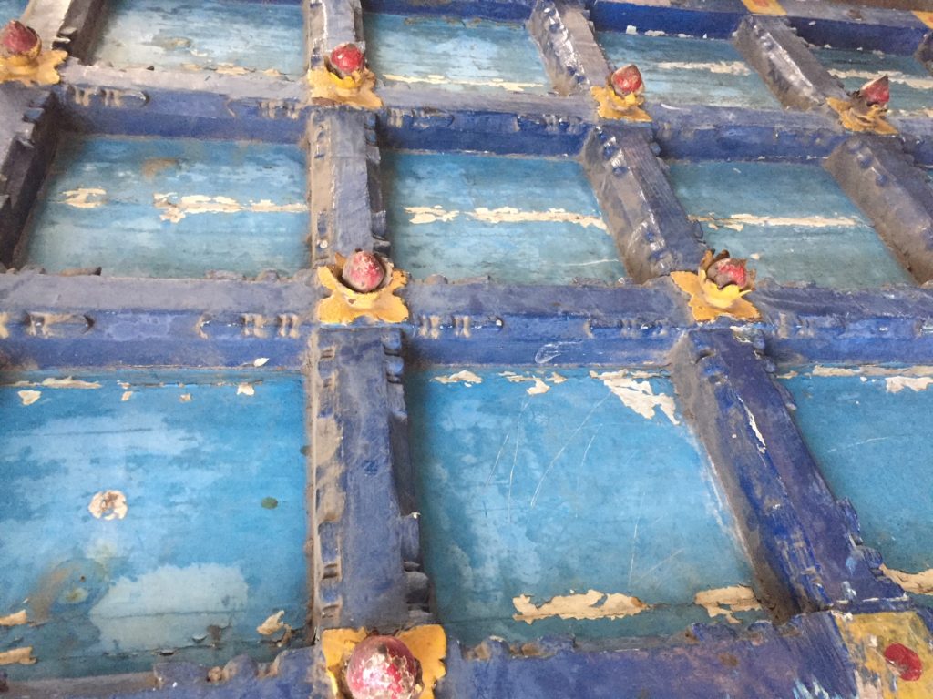
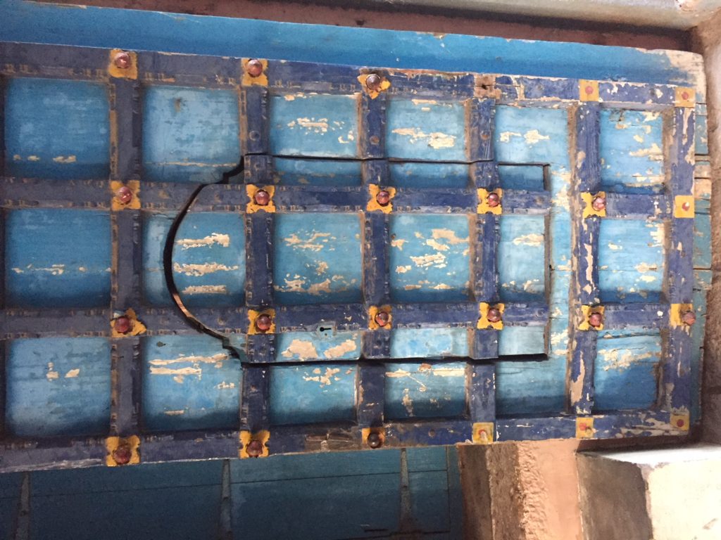
Close up of the blue tones and textures of the weathered temple door.

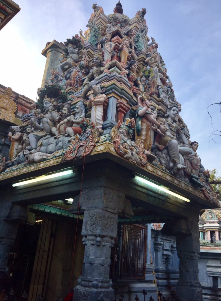
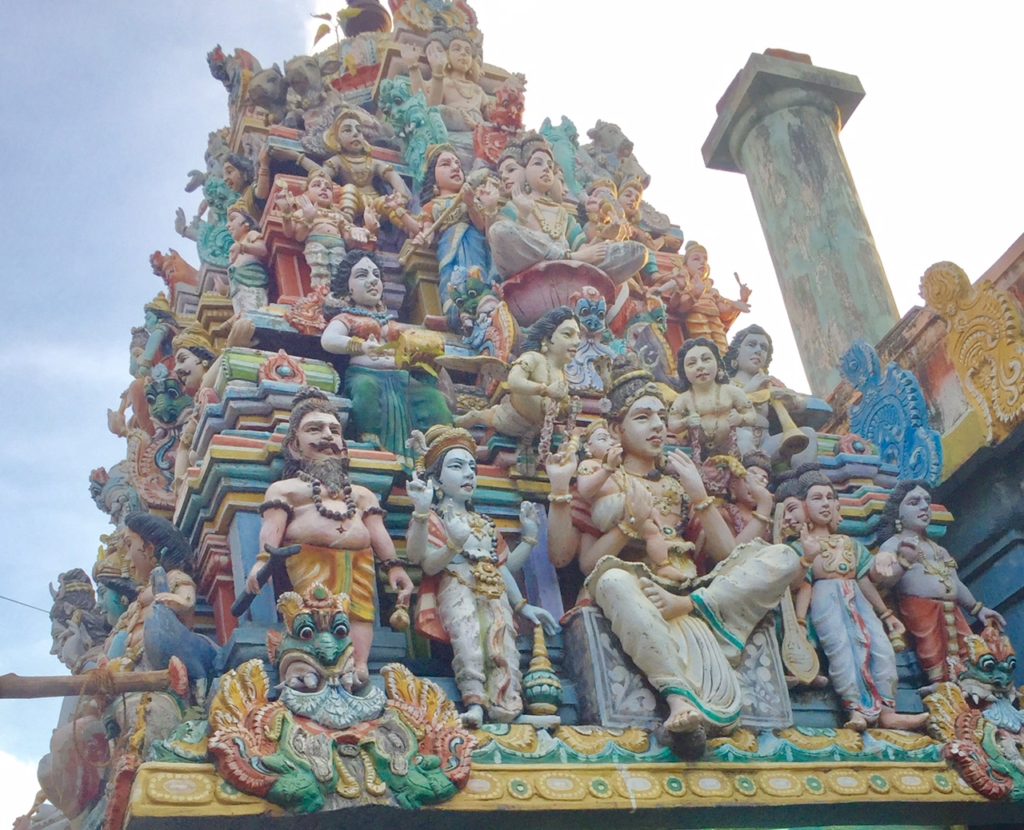
A kaleidoscope of colors, adorn the sculpture deities that make up the pyramid shaped temple “tower”.
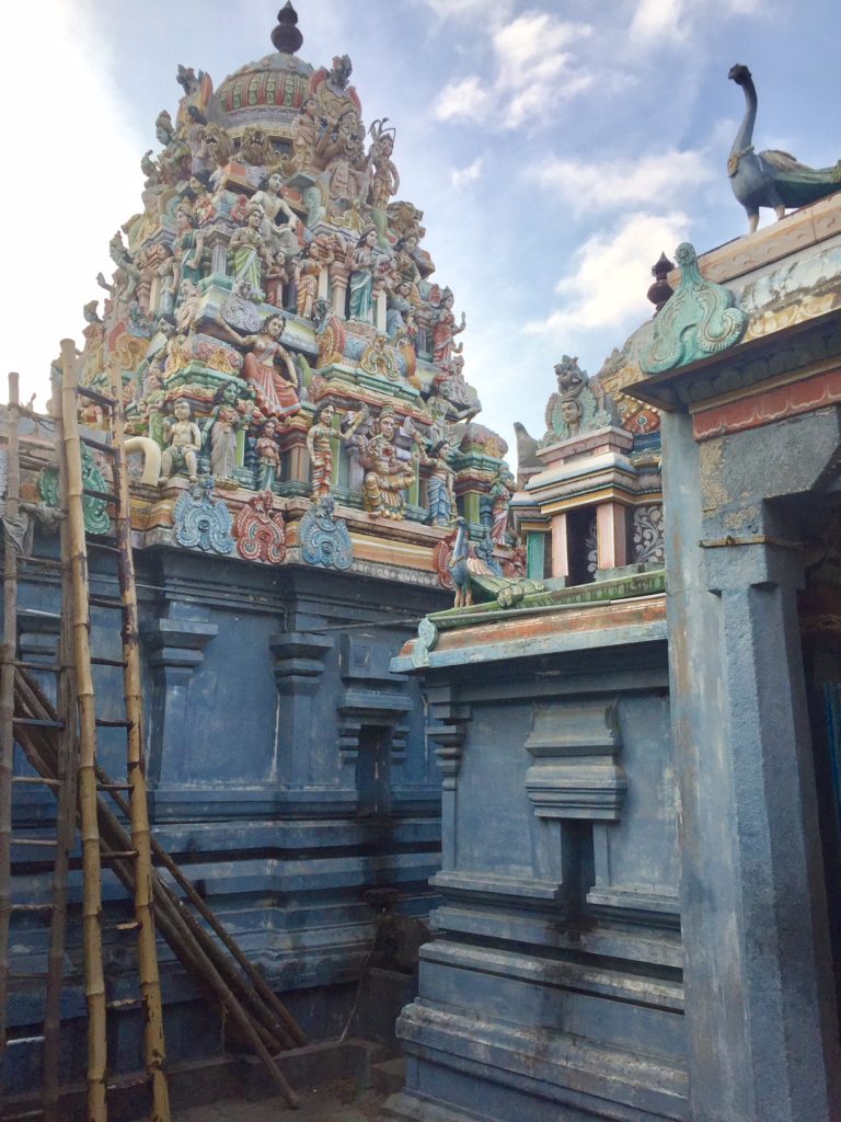
Pastel colors and more saturated ones are combined on all the walls, pillars and structures.
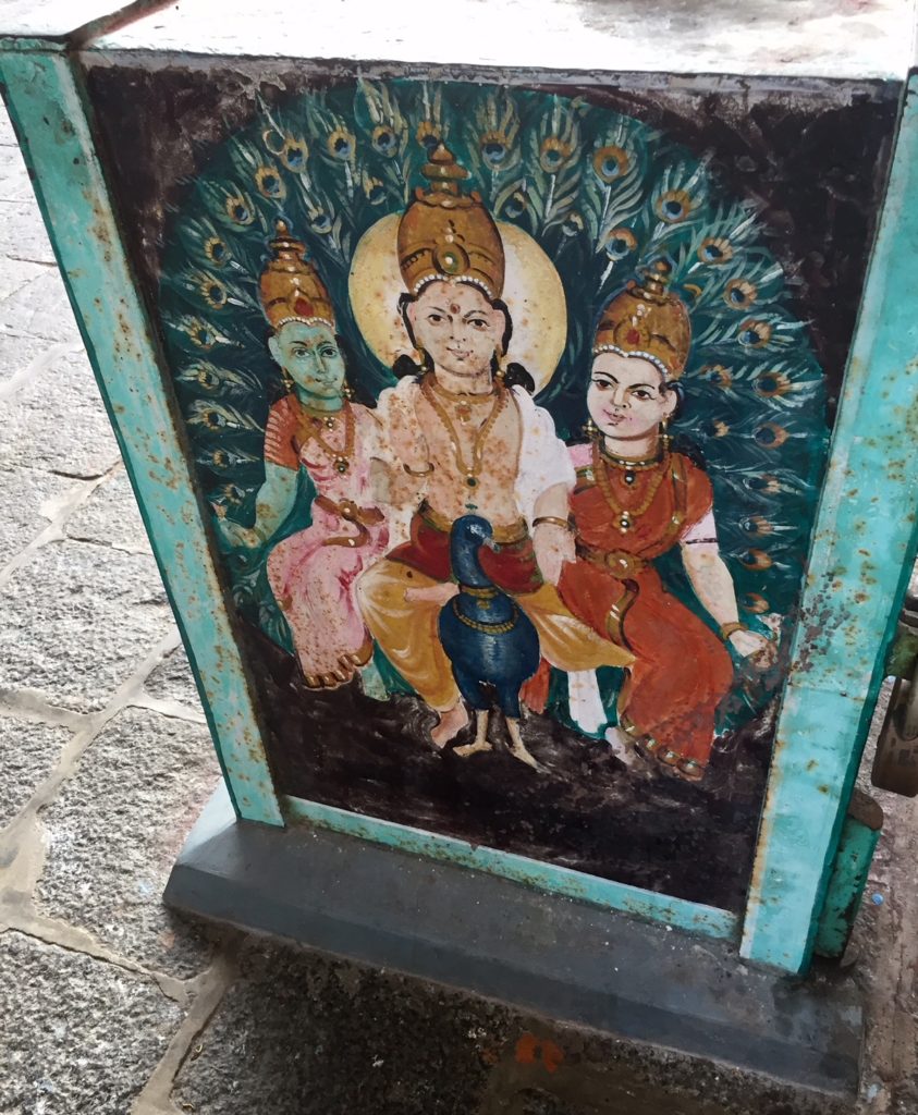
Ruby red and deep teal make for striking mural of three figures set against a fan of peacock feathers.
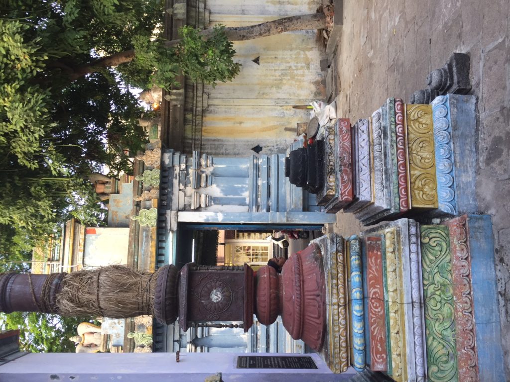
Layers of color, much like a fancy cake with different frostings, create the base of many of the pillars in the temple courtyard.
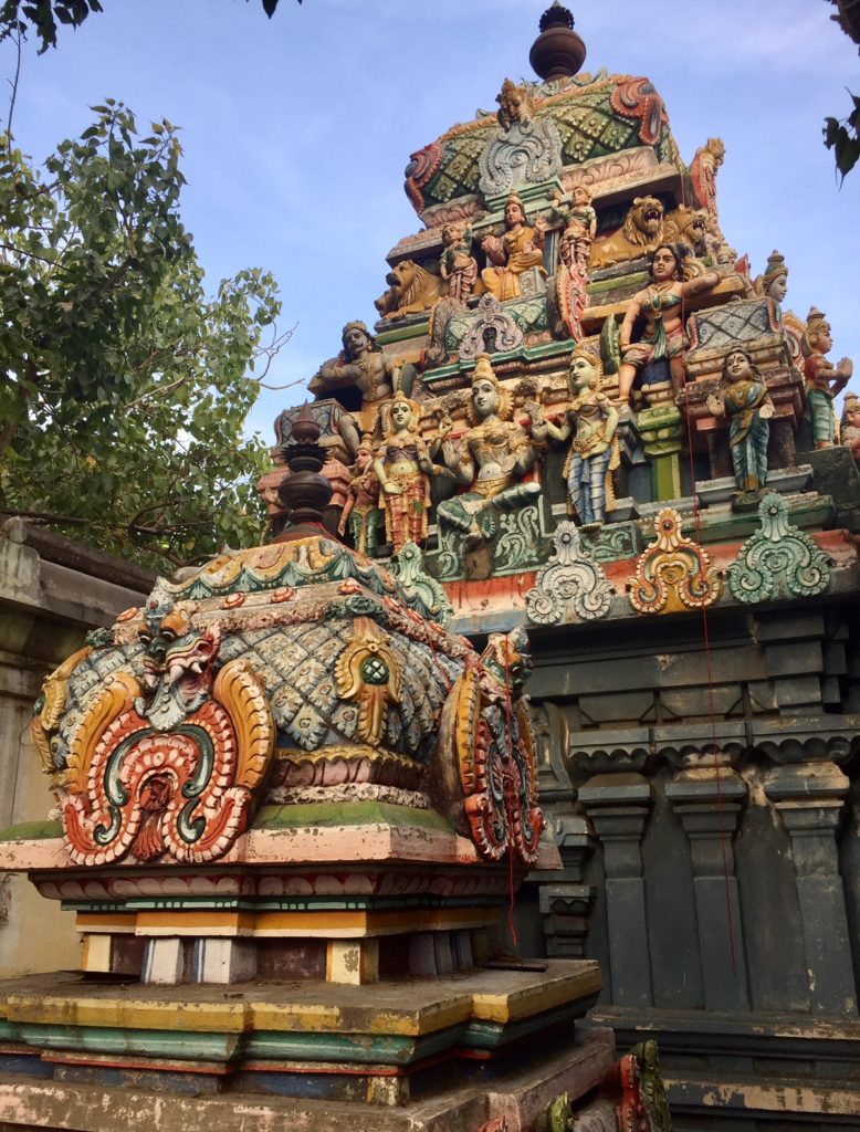
It takes time to have one’s eyes adjust and one’s brain absorb the multitude of sculpted gods and colorful creatures that adorn this pantheon.
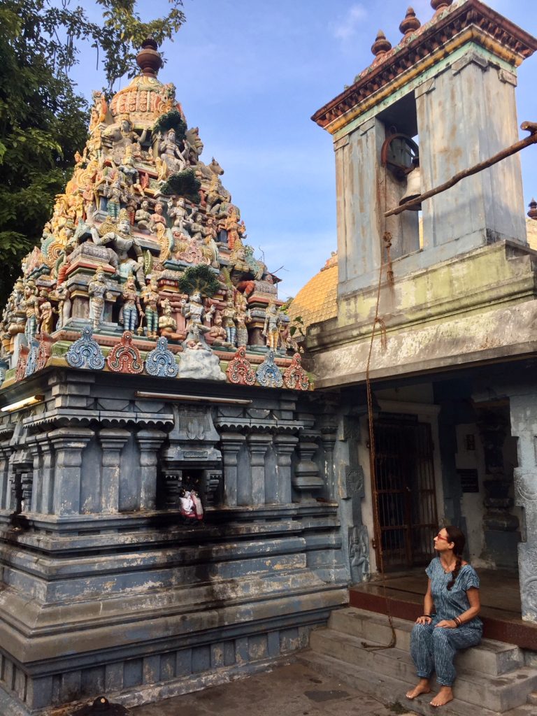
We take the time to sit, absorb and just be in the moment. Temple life goes on around us…
When the afternoon sun hits the sculptured multi tiered edifice, the colors deepen against the blue sky. The designs in the foreground are primarily bright red and orange, much like the flowers which are sold outside almost every temple.
 Color, color everywhere.
The temples are used all day long not only for prayers and reflection but also as a place which provides quite respite from the busy noisy world outside the temple doors.
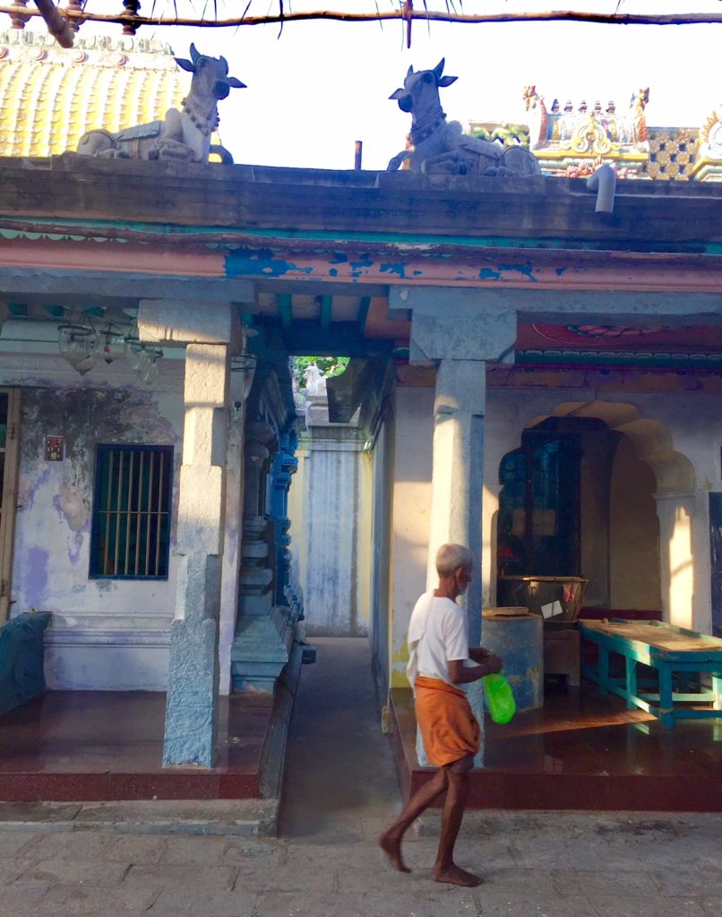
The bright orange of a man’s sarong, stands out against the pastel shades of the courtyard walls, underneath the sculptures of sacred cows on the roof.

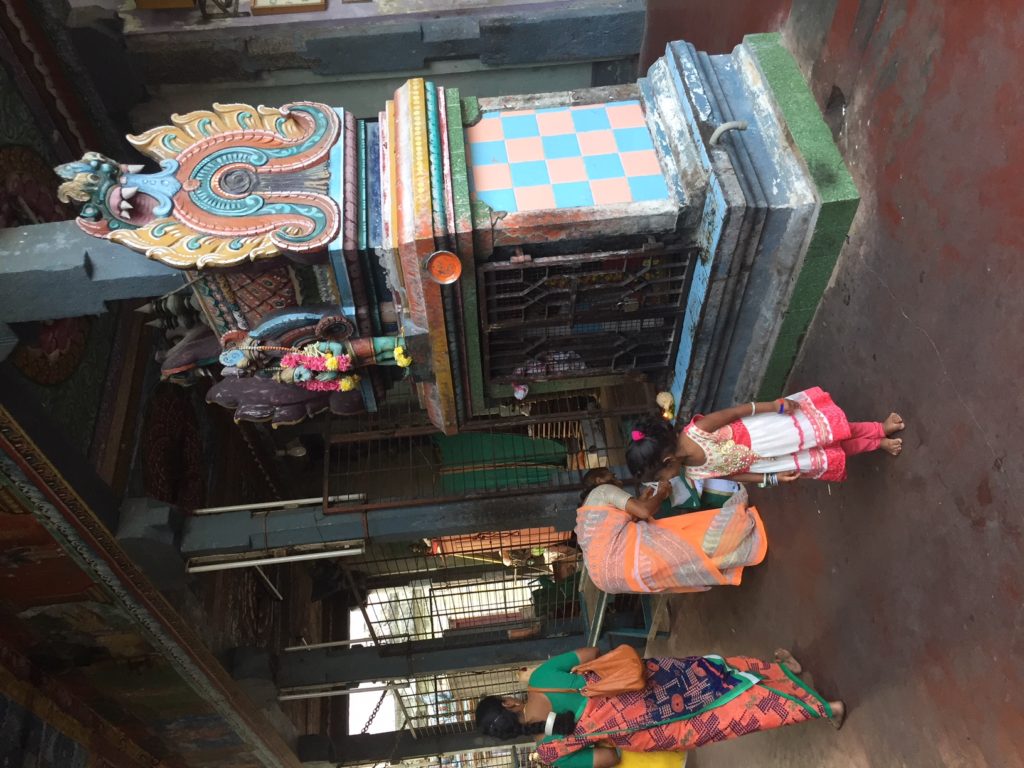
Peta shares a moment with a little girl and her mom (in a bright orange, red and green sari.)
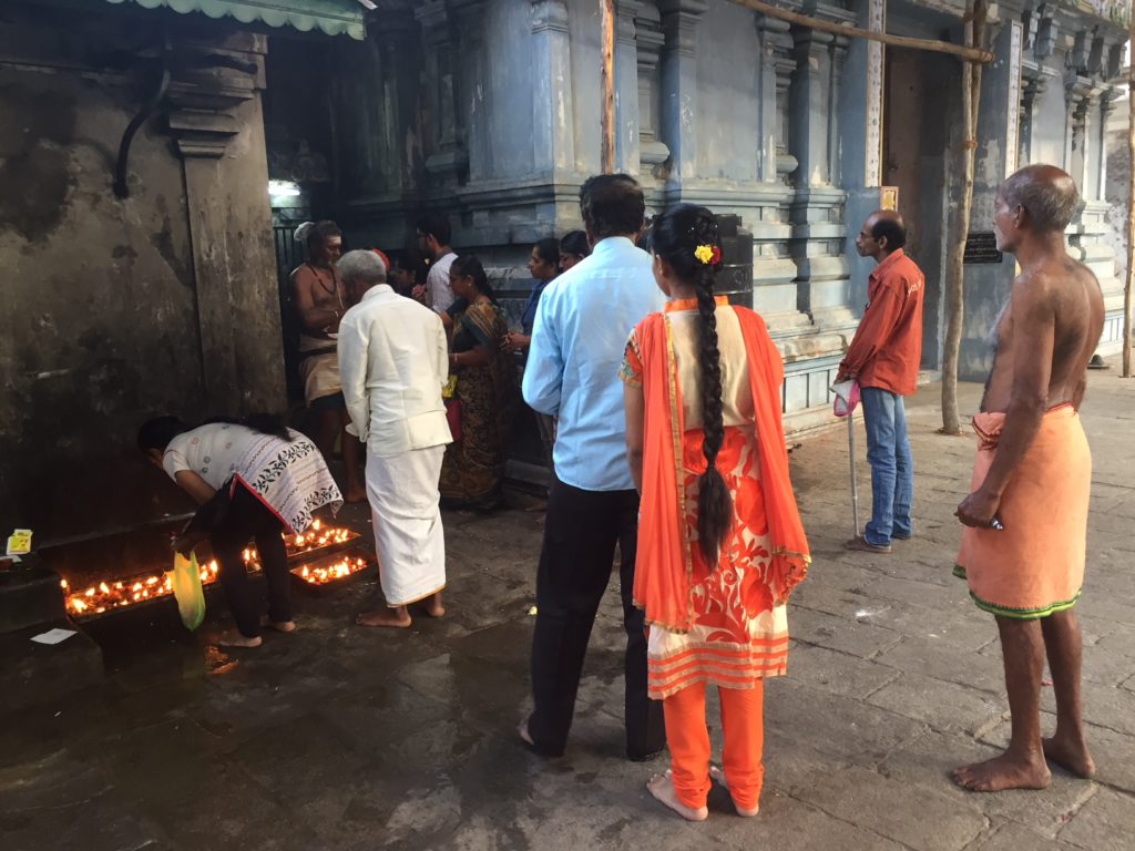
Devotees await their turn to receive blessings from the temple priest and to light an oil candle. A girl’s long black braid is striking against her deep orange sari.
A Hindu temple feels like being in a fantasy land of unusual characters and colors all clustered together.
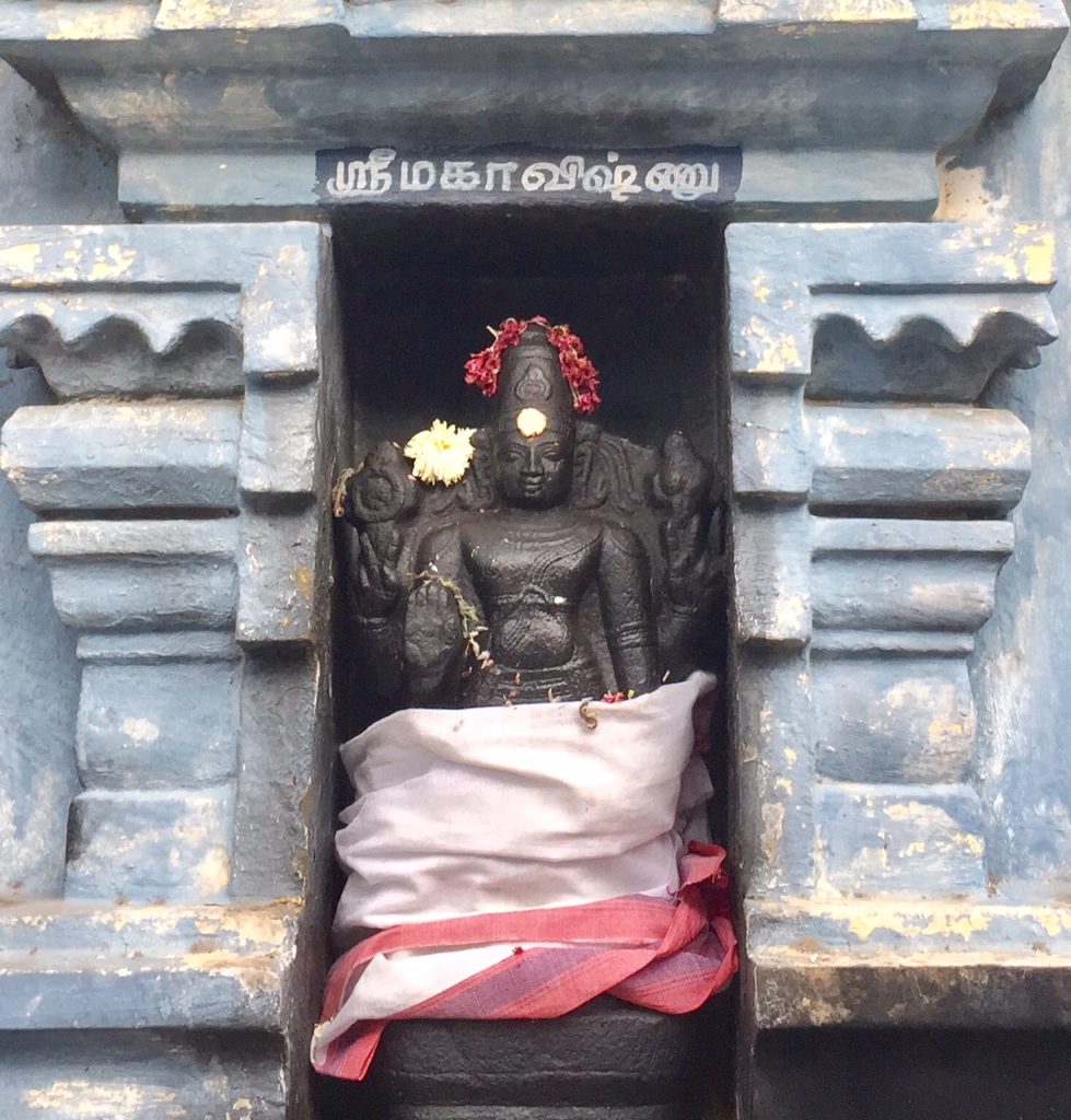
A black rock sculpture of a god is more sombre in comparison to all the brightly colored figures all around.
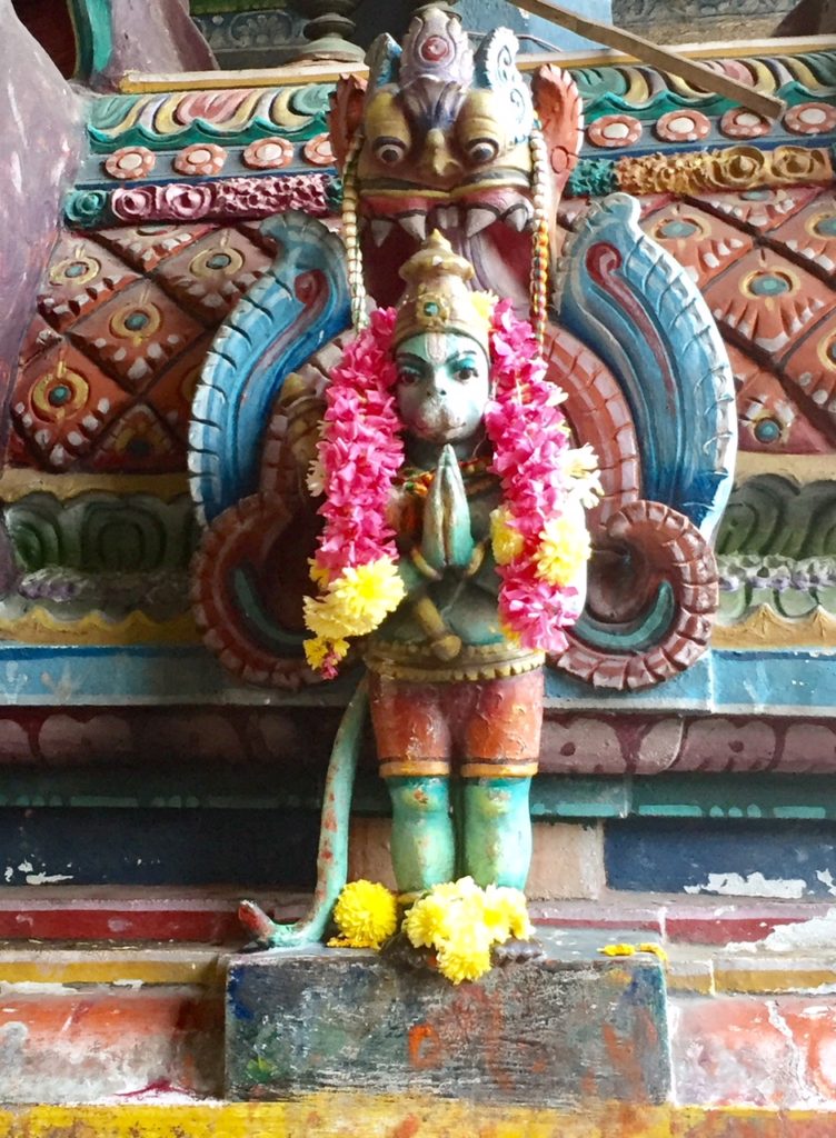
Worship of Hanuman the monkey god helps to counter bad karma from selfish deeds. Red and yellow flowers are draped over his shoulders and at his feet, by worshippers.
There is so much we don’t know about Hinduism, and Tamil Nadu temples in particular. We sought here to share, authentically, our experience ~ we enjoyed the architecture, the magnificent deities and sculptures, the colors that are everywhere, and our interactions with some of the people we encountered during our visit. For anyone intrigued and left wanting more, we invite you to take a look at this in depth review of Tamil Nadu’s most venerated temples.
That’s one of the things I really loved about India – the amazing eye-popping colour.
The colors of India continue to delight us even though this was our third trip to India. We never tire of seeing brightly colored saris against colorful walls.
Peta
Lovely photos.
Made me reflect on how beautiful I think the weathering of paint looks in other lands and places and how paint, peeling and worn away on modern buildings in the West looks terrible. Esthetics is relative . . . as is the means for upkeep.
Time wears aways all surfaces, man-made and God made.
Thanks Judith.
Great comment. It is all about perspective and context, as you observe. Totally agree that on modern buildings the result of lack of upkeep can make them look neglected and derelict whereas when the building has it’s own history and character then it all kind of makes sense.
Peta & Ben
I love the colours! I have always thought India was a colourful country although I have not yet been there. Your pictures do a good job of showing us this is true.
Darlene, this is just an example of one temple. You might enjoy our post from a previous trip to India where we wrote about the colors of the saris and more importantly have some amazing photos of them.
http://www.greenglobaltrek.com/2014/10/the-colors-of-verkala-india.html
Peta
SO beautiful! Having never been to India, I am in awe of how colorful and beautiful the buildings and clothing are! Thanx so much for sharing the lovely photos.
Thanks Lyn, and thanks for stopping by to read us and leaving a comment. You might enjoy our posts from a former trip to India, this one in particular which highlights the colors at the holy beach of Verkala in the South.
http://www.greenglobaltrek.com/2014/10/the-colors-of-verkala-india.html
Peta
What beautiful colors! The pastel colors of the temple in your pictures makes me wonder if it was always that way, or was it originally painted in bright colors that have faded over the years. Either way, it is glorious!
Janis, we have observed that the newer temples definitely have brighter, somewhat more garish colors than older temples such as this one. So they probably have faded somewhat, but as well I think that today, a different type of paint is probably used, and therefore the end result is somewhat different.
So glad that you enjoyed this post!
Peta
I adore the colours of India. The houses, the clothes, the temples, the art, the markets—colour everywhere you look.
Yup yup yup. That is definitely a highlight of India! No other country in the world delivers technicolor like India. And the only problem is that after India, other countries appear kind of bland. Caveat emptor!
Peta
While all the bright colours are so striking, the beautiful pale blue acts as a great backdrop for all the colour around it. Your photos show a visual treat!
Thanks Joanne. Good point. We also both loved that shade of worn soft pastel blue, which is definitely a great backdrop for the brightness of everything else.
Peta
Colors are everywhere and they are beautiful…..What a loss for the colorblinds 😥😥😥😥!!!!!!!
Madame Bell, I think you missed the point of this blog entry 🙂 It is the OPPOSITE: despite being color blind, the colors are so vibrant that I have no problem seeing these. So it is more “hurray for the colorblinds”! in India…
Ton fils
Ben
I did not realize that you are color-blind Ben. I am glad that India treated you (and you in turn us) to such a glorious explosion of color! Can not wait to go to India. And the taste of color that I am getting here in Sri Lanka is a nice appetizer 🙂
Lisa, Sri Lanka being a color “appetizer” is a great way of putting it! We were just talking about this yesterday.. the fact that Sri Lanka is second to India with regards to color. In some regions of Sri Lanka, such as around Tissa Lake for example, many of the men outshine the women with their colorful sarongs.
You are going to love India! But beware, it makes everywhere else seem bland in comparison.
Peta & Ben
This is so beautiful – amazing colours. I’m glad you got to enjoy them, Ben particularly.
Thanks Anabel. The only other place where I am able to pick up such vibrant colors is when we go snorkeling. Somehow the light reflection through the water is different in the way I can see colors, despite being color blind and can see the brightly colored fish, no problem.
Ben
Beautiful! Thanks for the dose. We’re still in a grey scale world here, and even sepia would be fun. Ben, I’m guessing you are red/green color blind, since these photos favor orange /blue.
Sharon you make a good point.. with winter and long grey days. Yes, Ben is red/green color blind but also confuses turquoise with purple and they both look blue to him. Who knows what he actually sees…
P
I have always heard that India is a very colourful place. Through your eyes, I can see why!
Lynn, I think India would be colorful to absolutely anyone. There is nowhere else in the world that there is so much color all around. It is quite a sight to behold.
Peta
Wonderful kaleidoscope of colors here, Ben, thank you. I enjoyed the intro and your explanation of what you see. Great photos, as always. When I looked at the pillar base with the multiple colors, I was especially moved, realizing how many hundreds and hundreds of pillars like that that I have looked at on statues around the world, and never have I seen them in multiple colors. Thanks to you both for bringing me so much color today and every day.
Thanks Jet for the lovely comments. Happy to bring you “color today and every day”. Glad you enjoyed our photos.
Ben
Have you always had a limited colour range, Ben? I suppose you don’t miss what you’ve never had but India must be an assault on all the senses.
Yes I have always been colorblind, it is a hereditary condition, which apparently skips a generation. Peta has noticed that sometimes I will see what I think is a certain color in her paintings and often the color I see is a combination of tones which has that color in the combination.
This condition is no big deal, except of course that in my work in the aerospace industry, we typically use a red/yellow/green highlight for program updates and of course I cannot distinguish one from the other!
Ben
My father was colorblind and as a child, I didn’t appreciate that he lived in a sepia world. But then my son was born colorblind (which we discovered when he got in trouble with a teacher in 2nd grade because he wasn’t following instructions on how to color a paper!). I learned, then, to wear bright colors for him, for my dad, and now, for myself just as much. And that’s the primary colors (once I wore a beautiful green dress for a holiday outing, and my son,10 at the time, asked why I’d wear such a gloomy dress. To him, it was deep brown). So, long story of saying how I grew to realize that color shines light/love/awareness, and I believe, the bright colors of spirituality (think of the chakras) for our souls. The first Hindu temple I visited was in Singapore, and I was amazed and delighted at its colors. Why don’t ALL churches/temples/synagogues swathe themselves in color, I’ve wondered ever after. Your photos brought it all back to me – the glory of color, and how the soul responds. I love reading that Peta wears bright colors for Ben. I totally understand.
Pamela your personal validation of the color blind experience is awesome. And the fact that you adjusted your wardrobe, much like Peta has, is a testament to the accommodation and adjustment that we make for people we love. Sometimes I get dressed and Peta looks at my color combos and says “um, no. I think you have to either change the top or the bottom but those two colors do NOT work together!”
Yes, color is so important. There have been studies done which show the emotional impact of different colors… For example, the calming effect of greens, the joyous impact of yellow etc. And yes, great point, the colors of the chakras!! Absolutely.
Totally agree that places of worship could learn from the Hindu temple about color and the impact thereof. Of course stained glass windows from churches in Paris, do come to mind and they were magnificent.
Thanks for these terrific first hand rejoinder on the color blind theme! Super. Loved it!
Ben (& Peta)
That’s some temple! Thanks, Peta.
As Pamela below says.. if only all temples, churches, synagogues could have such bright colors!
I too love the beautiful colors that we often find in other countries. I think that is why we are drawn to many of the Central and South American countries. Love seeing this part of the world through your eyes.
Thanks LuAnn. One of the reasons we loved living in the colonial city of Granada, Nicaragua for six years was that every house had a different color. Then when we visited family back in the U.S. we were struck by how houses are for the most part in most cities, either painted white, or beige or grey ~ probably for resale value. Our house in Chicago, while we were going back and forth to Granada before we moved there, was “influenced” by the color palette of Granada and we had a lilac colored door, some yellow, some orange walls. It was awesome!
Peta & Ben
It’s almost (but not quite!) overwhelming, isn’t it? I can’t wait to see everything India has to offer myself someday. I’ve been close (Nepal, Tibet) but somehow never gotten there yet.
Lex, India can definitely be overwhelming, especially in the big cities. The color is never overwhelming for us, but the noise, the dust, the traffic, those things can sometimes get a bit much. It is all very worth it. I think you would love India. One of the reasons we had hoped to get to Arunachal Pradesh, is that it is so close to Tibet and many of the people there are closer to Tibetan than Indian. Oh well, maybe another time.
Ben & Peta
We had planned to go to Tamil Nadu originally but changed our route because the weather is so hot! Sad we didn’t head that way but I am very grateful to be able to see these pictures and live Tamil Nadu vicariously through your adventure there! Love all the colors! Ben I love the part where you describe how Peta’s brightly colored wardrobe brings color to your life…very touching:)
Thanks Gary. I imagine that your current adventure is but a start in a life long relationship with India and Asia in general. So Tamil Nadu will still be there and no doubt you will get there one day. In the meantime, we are thinking of you.. in our favorite place in India, Pushkar! Pushkar for us is like a smorgasbord of human experience, with so many interesting characters. Look forward to reading about your experiences.
I recall that we have had many conversations together with you about travel, and am so glad that you made the jump together with Navit. Congrats on incorporating your life work with your travels.
Ben (& Peta)
What a plethora of colors, Ben! What a joy! The “roofs” of this temple are just incredible, Mind-blowing. Beautiful photos as well. My favorite is the one of Peta, blending in with the pastel blue wall and looking at a small part of the temple with its intricate roof. I had no idea about the reason behind Peta’s colorful dress code!
Liesbet, thanks for these lovely comments and compliment on the photos. It is way easier of course for me to wear bright colors, such as the brightest yellow, in India, where I fit right in. The same clothes in the U.S. or Europe and I would probably be mistaken for big bird or a sunflower on the go.
Peta
I appreciate the way you guys fit in with your clothing everywhere you go. Very respectable and respectful! You made me smile with you “Sunflower on the go”. 🙂 And, is big bird a reference to Sesame Street?
Liesbet thanks. You know how some people start to change their accent when they travel and naturally take on some of the natural linguistic pattern over time? For us, we naturally start converging to wearing some local clothes as it often feels more comfortable to us and in the case of India, it’s a treat to brighten up the wardrobe.
Yes, Big Bird from Sesame street. Huge big yellow bird. 🙂
Peta
One of those people automatically changing some of their accent and taking over local ways to say something, is me! 🙂 BTW: Ali was not really ignorant about Big Bird… it’s just that we don’t have him in the Dutch version of Sesame Street. I grew up with Blue Bird! Isn’t that interesting?
I meant “I” was not being ignorant. Not “Ali”. Stupid auto-correct!
What a beautiful photo essay! Took me back to my childhood. India indeed is a land of color!
Dhara, welcome to Green Global Trek. We are wondering where you grew up in India? So glad to have brought back colorful childhood memories. One of many contributions to the world that India offers. Thanks so much for stopping by to read our post.
Ben & Peta
Love the photo with Hanuman and his garland of flowers. I will have to find my diary from my 1984 trip to India to work out what famous temple this reminds me of. Madurai? I think. Louise
Louise, happy searching in your diaries from the eighties, am sure that will be a fun trip down memory lane. I was just thinking about the hugest Hanuman we saw in India, on the outskirts of Delhi on a previous trip, it was about 2 storeys high. Just huge.
Peta
I’m so far behind with my comments, but I didn’t want to miss telling you how much I enjoyed this: not only for the glimpse into a wonderful, colorful temple life, but also for the comments about “sepia vision.” My issue wasn’t quite the same, but the first sign of a need to address my cataracts was a diminution of color vision in my left eye. Suddenly, the grass was much greener in my right eye! Once I had the surgery, and had new lenses implanted, it was wonderful to be able to read without glasses, but the colors of the world glowed. Your posts recall those first days — and the wonder of color.
Thanks for your interesting comments. I think we all tend to take our vision for granted, and the fact that most of us can see colors. As is often the case, we recognize the true value once we lose the that capability or are reminded by someone who does not have it.
Peta
This was a wonderful memory for me of my Indian Adventure, now more than ten years ago. I loved Tamil Nadu, I loved Pondicherry. Thanks for transporting me back there.
Margaret thanks for stopping by to read Green Global Trek and for leaving your feedback. Pondicherry is definitely a special place. I would hazard a guess that it has not changed very much since you visited ten years ago. Glad we could offer up a walk down “memory lane”.
Ben
What a beautiful palette of colors: muted, faded, and pastels versus brilliance. You could almost argue that color could be classified as a separate sense! I especially love the photo of the weathered temple door with its blues, creams, yellows and pinks. So lovely.
Anita thanks for your appreciation of the pastel and vibrant colors. What an interesting thought.. having color classified as a separate sense. It has been researched of course to find that different colors produce different emotions, and that different colors have different vibrations. The weathered temple door photo is my favorite one too!
Peta
The Hindu Temple is really amazing, Peta. Those figures are all so different, too. 🙂 Gorgeous, colourful photo gallery.
Thanks Sylvia, glad you enjoyed the post and the photographs.
Peta
You’re right about the kaleidoscopic colors at this temple, the artists saturating the objects of their faith with emblems of their exaltation. My favorites are always your photos of children.
My husband has the most common form of color blindness. I’ve always been a bit frustrated that he can’t see what I see – but then, I can’t see what he sees either. A lesson there, between the pigments.
Shari thanks for the compliment on the portraits of children.
I often feel bad for Ben that he is missing out on the kaleidoscope of colors. One day we will have to try out those new glasses that are being made for colorblind people, that are super expensive (which is why we have not bought them) but would be interesting to use, if they do actually work!
Peta
I taught art to kids for nearly 30 years, and always had a colorblind student or two. Always a boy, always the same red-green colorblind that is most common. These kids impressed me with their methods of adapting to their situation, and most produced beautiful art.
Over the years, my students taught me how to teach them, coming up with inventive ways of bypassing whatever problem they had to deal with – dyslexia, information processing disorientation, even the kids with ADHD. Art is a journey, not a destination, definitely not a picture for the living room, and all my students founds meaningful ways of traveling through their creative endeavors.
I’m not sure the glasses will provide more quality to Ben’s life than what he already experiences, given how much he already contributes.